
The presenter is killing it. They've described a technical problem articulately and intrigued us with how they're going to solve it. We're attentive and engaged. Then the architecture diagram appears.
The slide comes up—BAM:
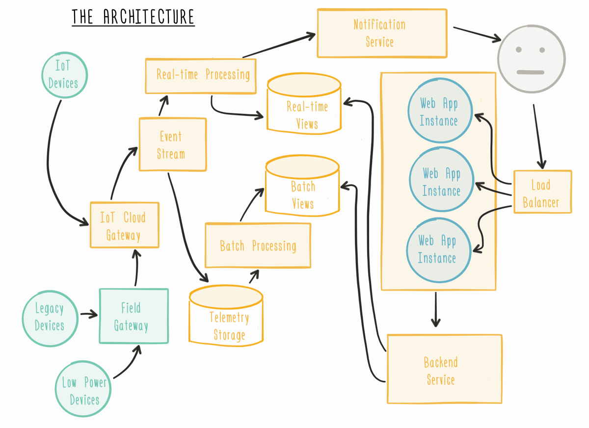
There are lines flying around everywhere, boxes of different shapes and colours. Our eyes divert away from the speaker to scan the diagram, trying to make sense of its parts and understand how it fits together. Do I start at the left or the right? What do the direction of arrows mean? Is there any significance to the colours?
Suddenly we're not listening anymore. The speaker has lost our attention.
Keeping the audience engaged is a challenge for any talk. To help people stay in sync with what you're saying, it's important to present any visual information in a simple format.
You'll have a wealth of knowledge around the details of the tech you're describing and how it works. If too much of that detail emerges on screen at once, the listeners are going to have a hard time staying with you.
But with a few small changes, you can improve your technical diagrams to make it easier for people to follow along as you speak.
Tailor the detail to your audience
Use a level of detail for your diagram that's appropriate for both the audience you're speaking to and the purpose of your presentation. Question the purpose of each element on the diagram and remove anything unnecessary.
If you're providing a high-level overview to a group of product managers, designers and others, consider what they need to know to understand the impact on their own work. Do you really need to include that load balancer or service discovery tool? Is it relevant to the main idea you're trying to get across?
On the other hand, if you're presenting case studies around site reliability issues to a group of engineers, those kind of details will be relevant to tracking down and debugging problems. You might want a more detailed diagram on a smaller slice of the overall system.
Sometimes you have to find a balance if you're presenting to different audiences in a single group. You want to be accurate while avoiding a level of precision and detail that will overwhelm listeners.
Perfection is achieved, not when there is nothing more to add, but when there is nothing left to take away. ~ Antoine de Saint-Exupéry
Keep text to a minimum
You are going to be speaking to the diagram, so only use text when you really need it. It's difficult for people to read and listen effectively at the same time, so avoid including blocks of explanatory text on your slides.
You can still include labels and hooks so that anybody who has their attention diverted can quickly catch up to what you're talking about.
If you do need to provide standalone slides for people to download later, you can create another copy that has more text included. But the version you speak to should only include minimal text. The diagram doesn't need to make complete sense on its own. That's why you're there.
Only reveal a few elements at a time
When you put your whole diagram up at once, your audience will start trying to process all the new information you've given them. They will run ahead of your talk. This makes it difficult for them to listen to you at the same time.
You also fill the gap in their knowledge too quickly. When you articulate a problem, you create curiosity about the solution. By revealing too much at once, you remove the tension that needs to be resolved.
Your visuals will better complement what you're saying if you reveal them across a few slides:
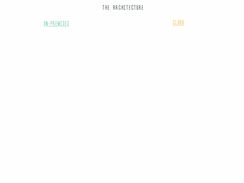
It might seem like more work to do this, but it only takes a few minutes:
- Start with your completed diagram and make this the final slide.
- Copy the slide and remove the last few elements you'll be explaining.
- Repeat this process until you're down to the first slide with just a few elements visible.
Or, if it is important to display the whole diagram, you can have multiple slides with each one highlighting the elements you're currently speaking to:
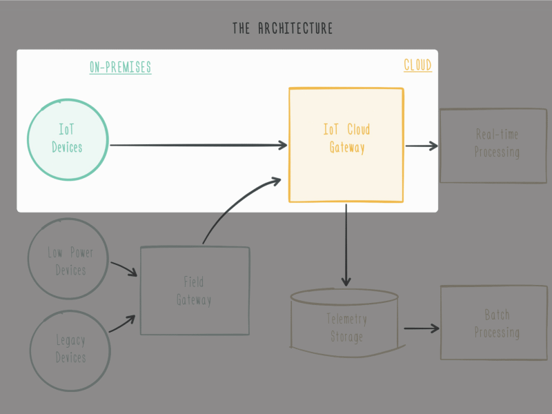
The principles above can apply to any visual information. If you're presenting a table comparing cloud service offerings, you could reveal one row at a time for each type of service. If you are using a lot of dot points, put each on a separate slide or reveal them one at a time while greying out the previous points so as not to distract.
You are always competing for the audience's attention. You are competing with our phones, with the plans we're making for the weekend, with the activity out the window.
Don't make yourself compete with your own slide!